
Placement project
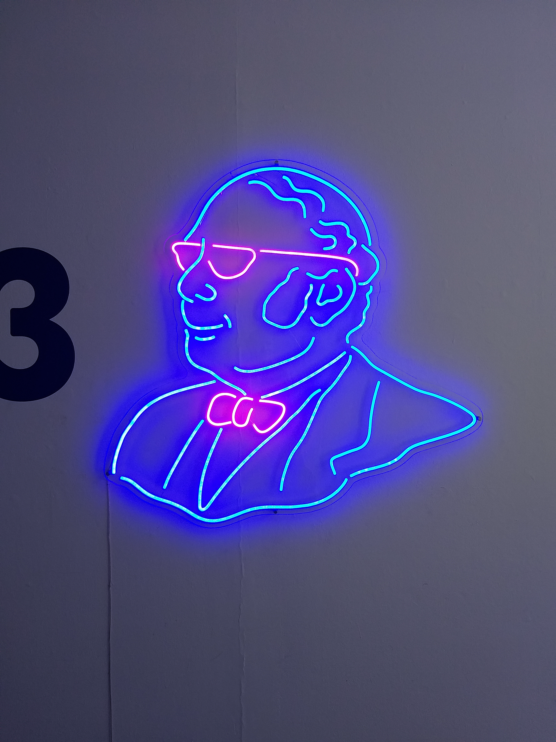
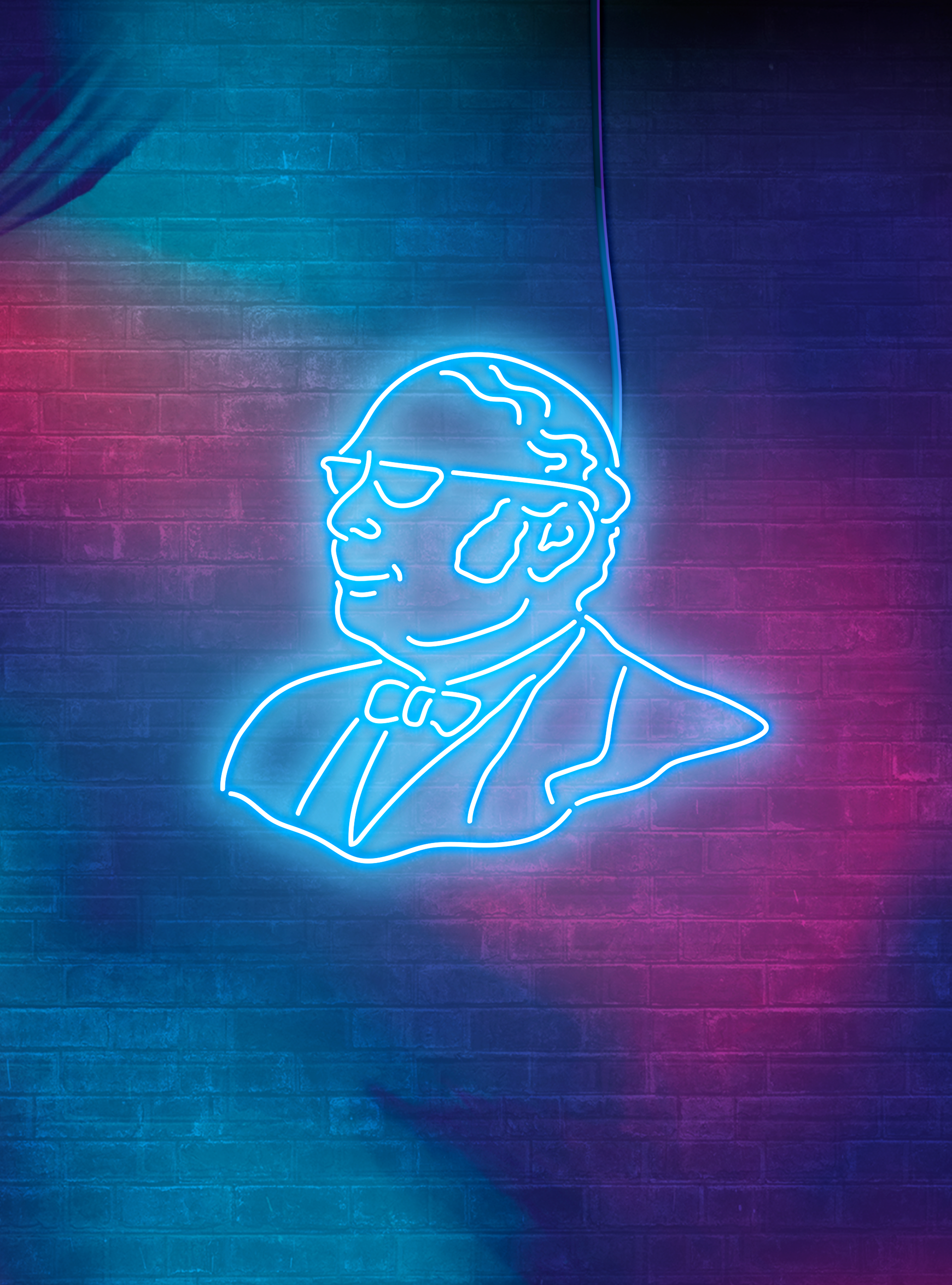
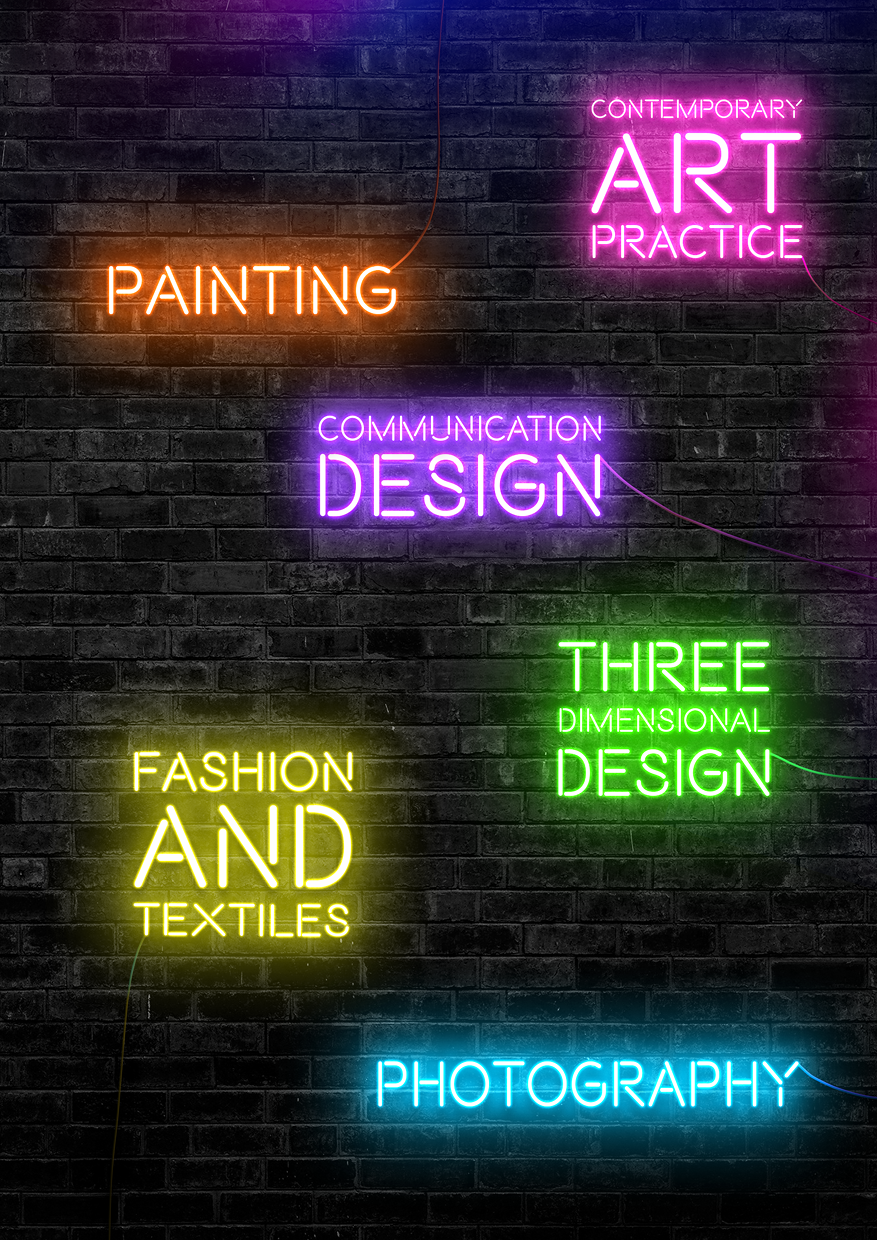
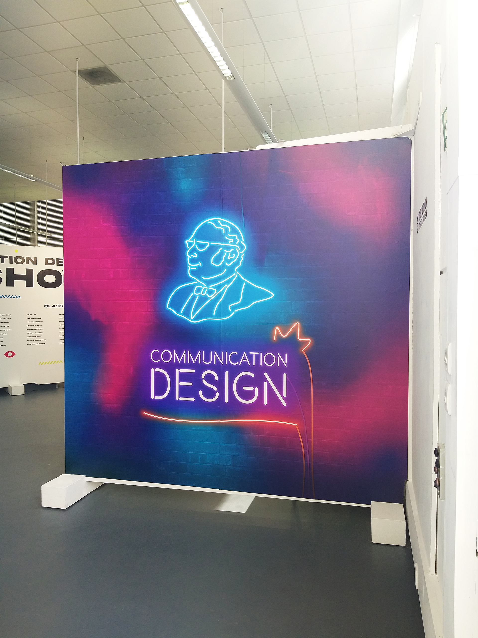
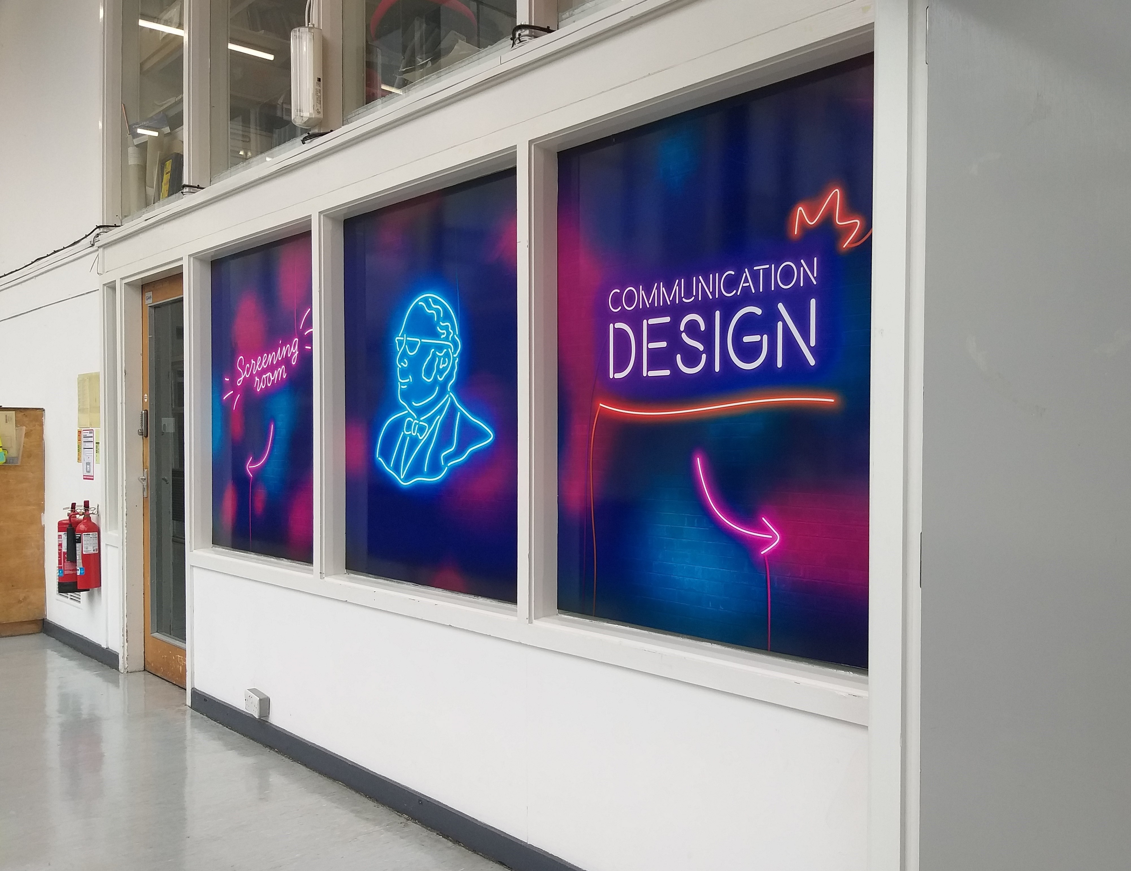
While on placement in Stage 3, I worked on the visual identity for Gray's Degree Show 23 along with another student. The Degree Show wordmark & the John Gray neon sign were designed by me, and the background is a combination of elements we had both used in our initial ideas.
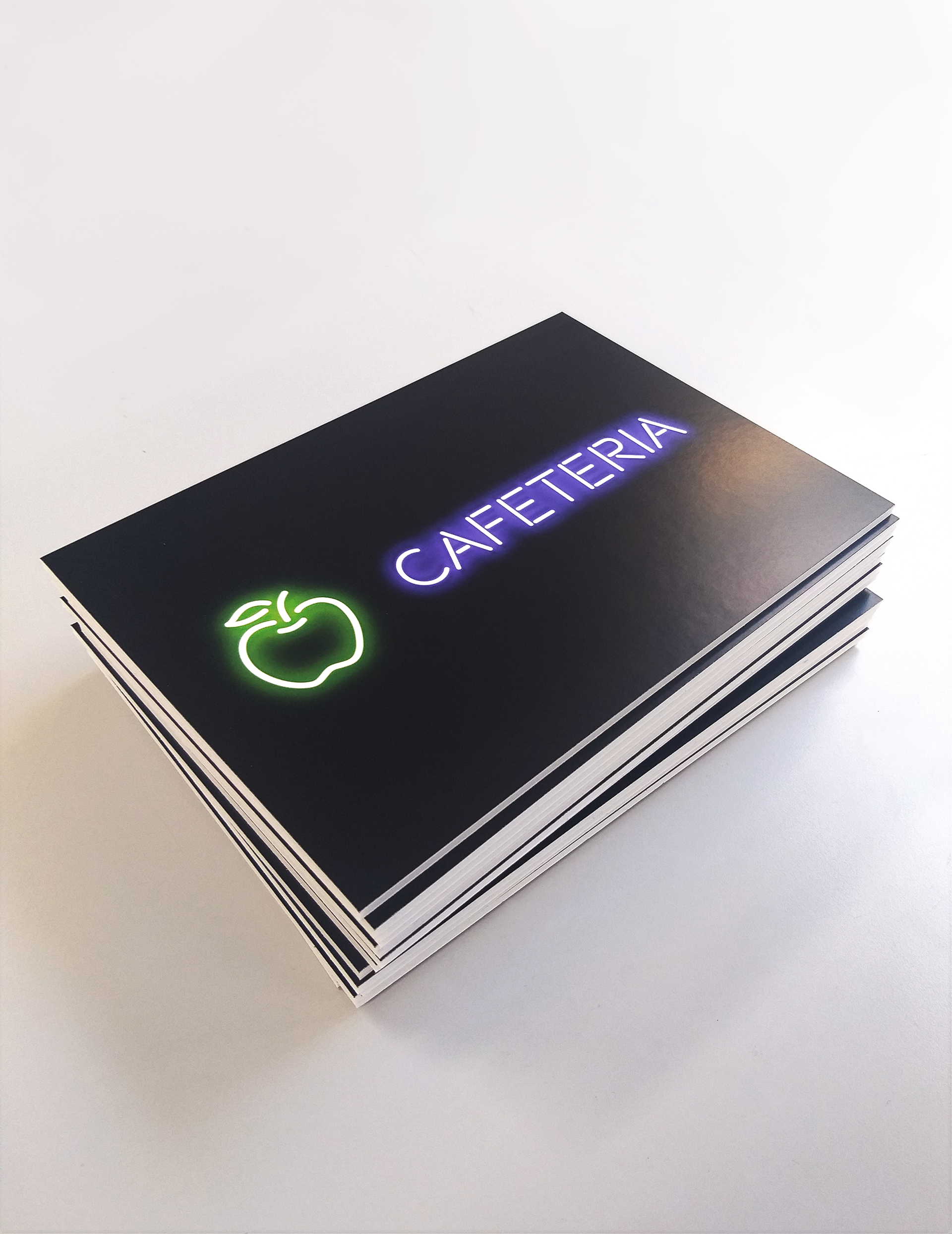
I designed physical & digital posters and ads, a physical directory with the work of all graduating students, lots of directional signage, large-scale vinyl and some leaflets.
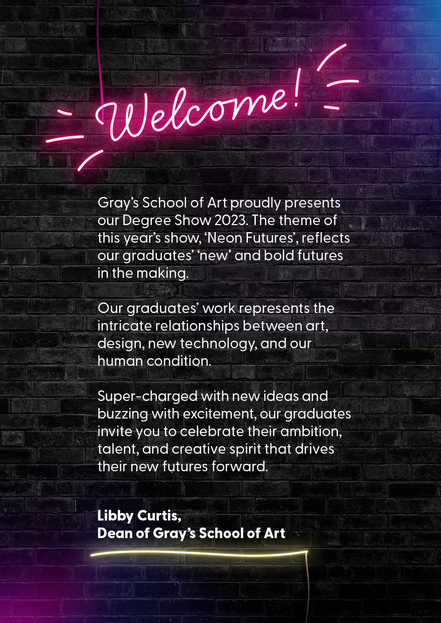
The set theme was 'Neon Futures' - the visual identity had to be vibrant, youthful and trendy and convey the graduating students' excitement.
This is the final look approved by the client, but I had developed other possible directions with visual language supported and inspired by a concept that would introduce a deeper meaning and a larger set of visuals and iconography to work with.
✨✨✨
This is the final poster that had to be translated to different aspect ratios for various purposes - owned & paid social media ads, bus stop and magazine ads:
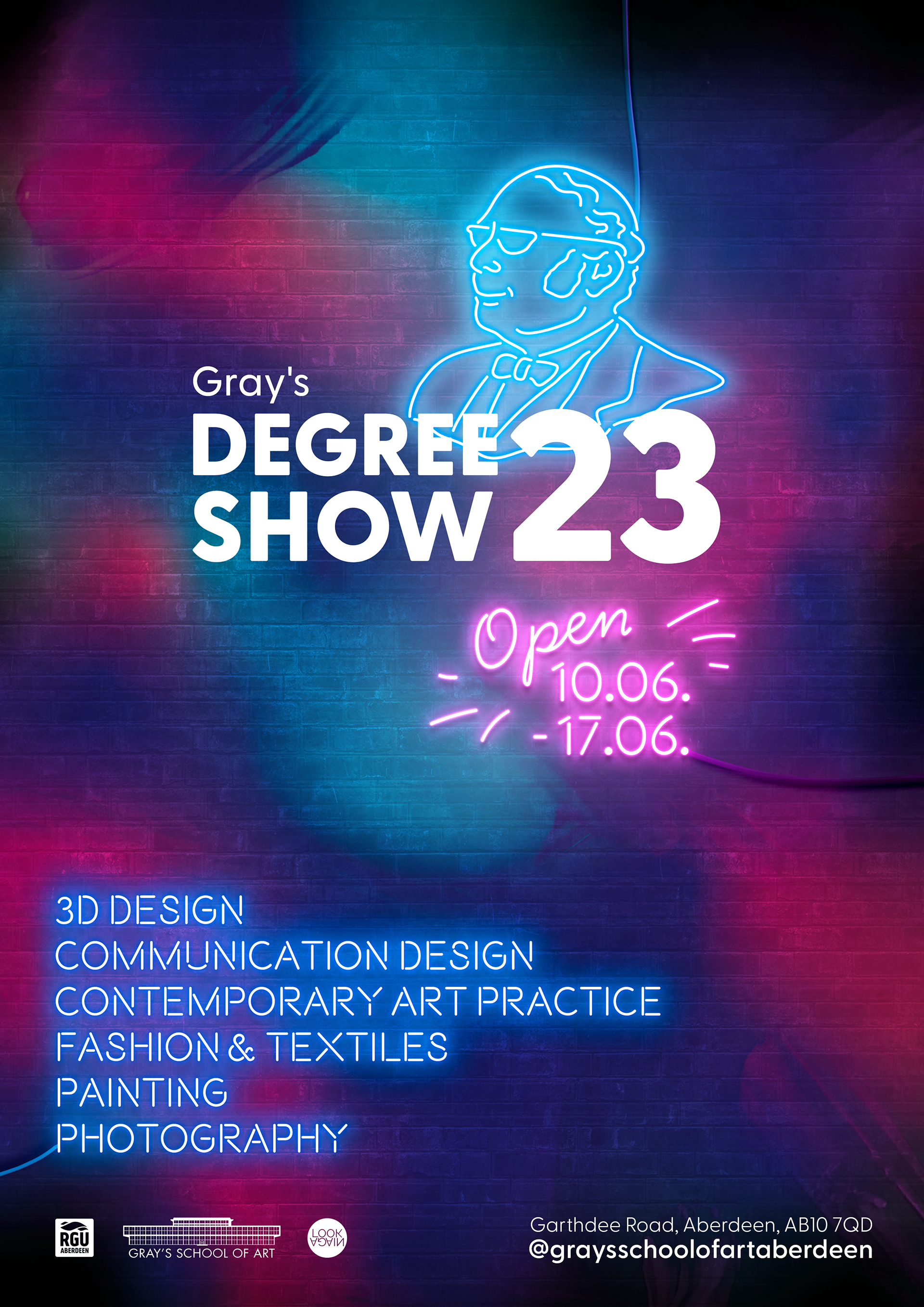
Poster - Gray's Degree Show 23
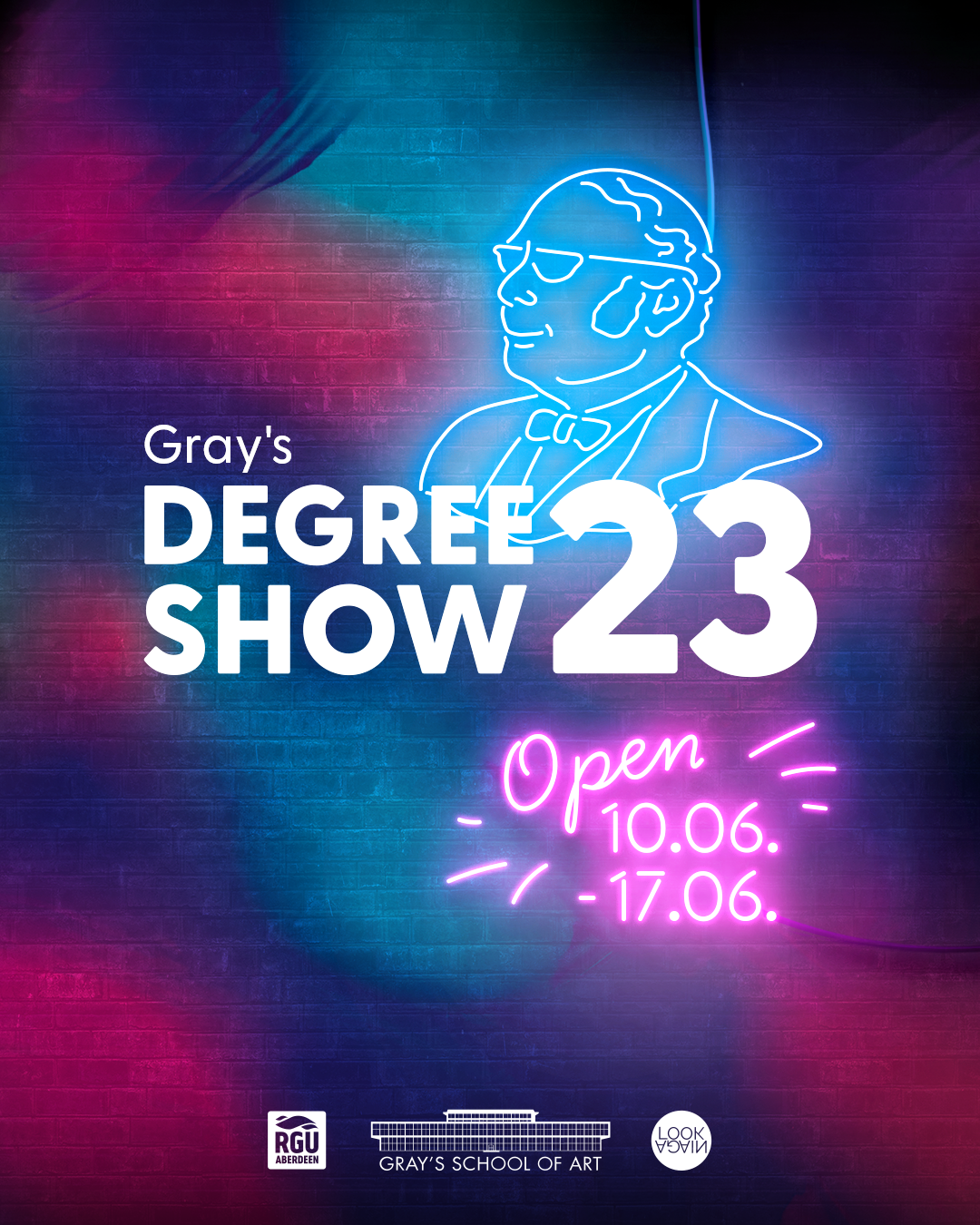
Social Media Post - Gray's Degree Show 23
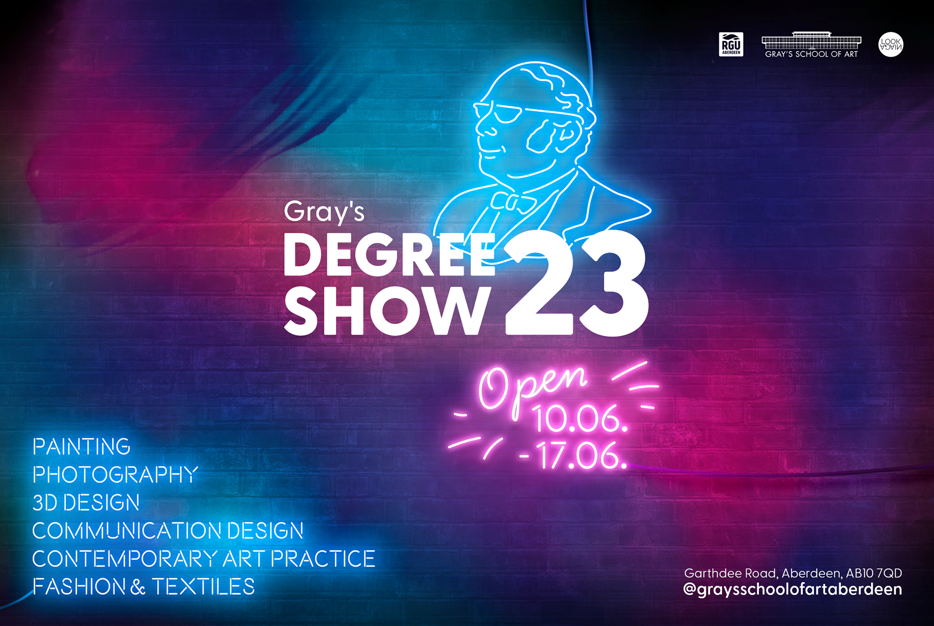
Magazine Ad - Gray's Degree Show 23
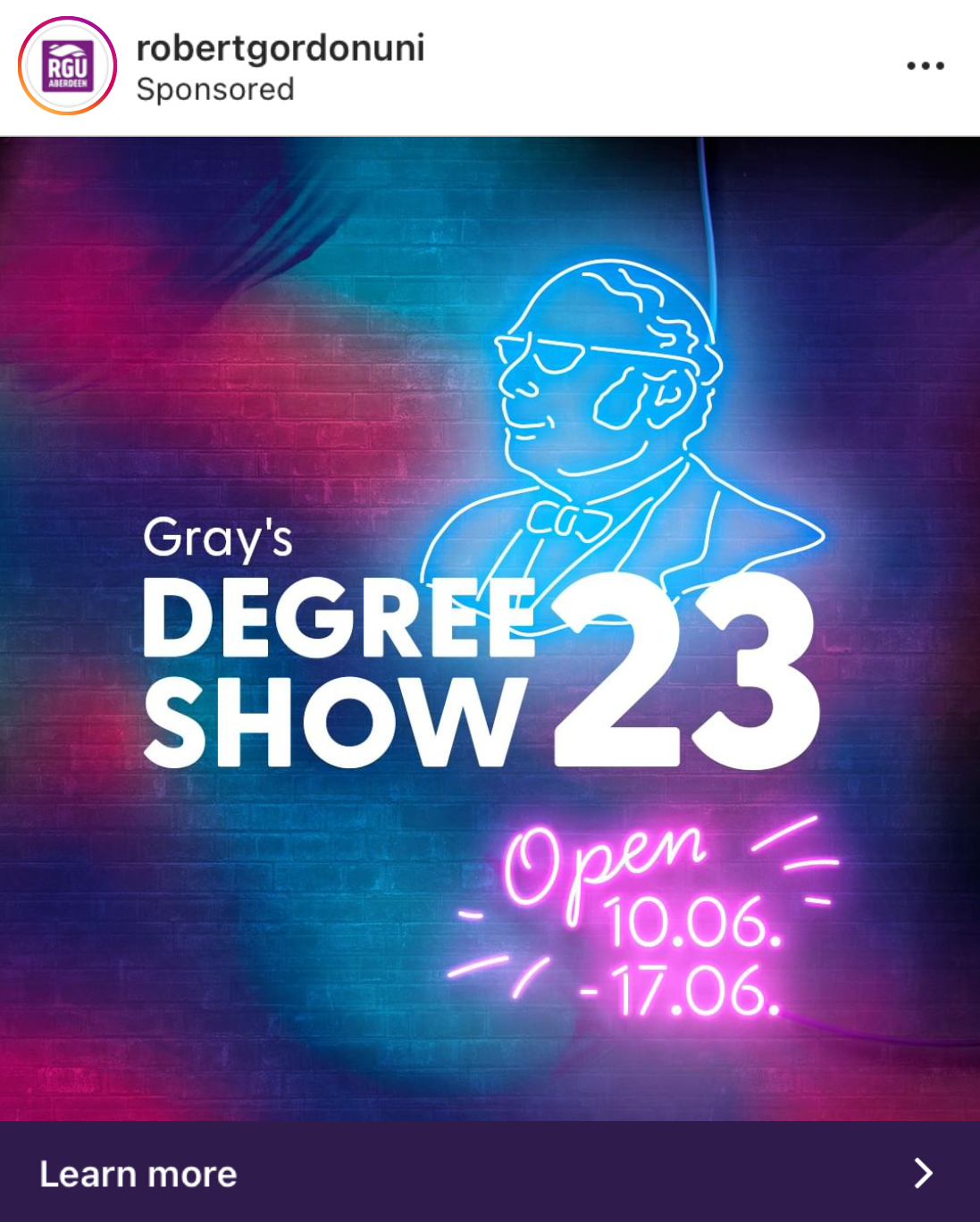
Social Media Paid Ad - Gray's Degree Show 23
My design was also turned into a real sign for Gray's entrance hallway which became one of the biggest attractions & the main spot for taking photos.
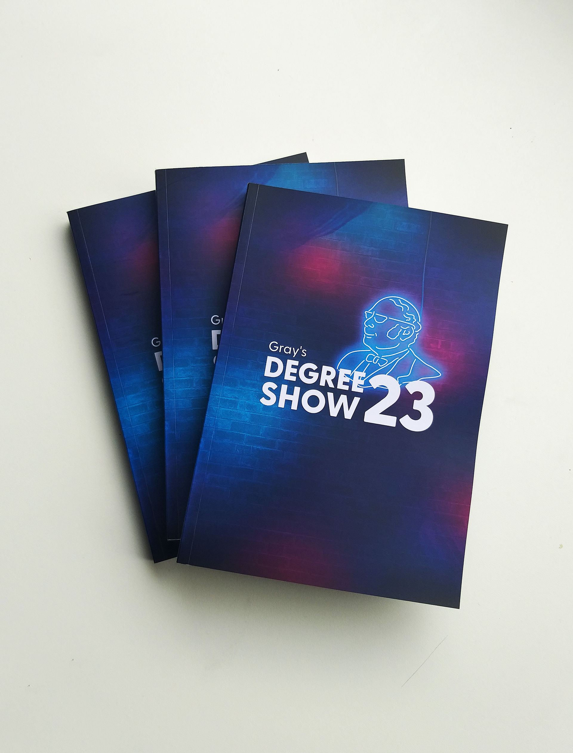
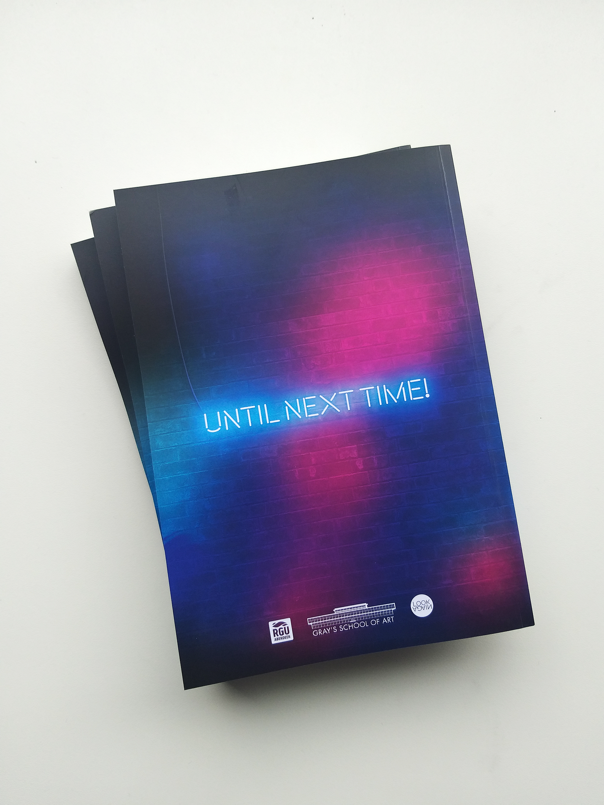
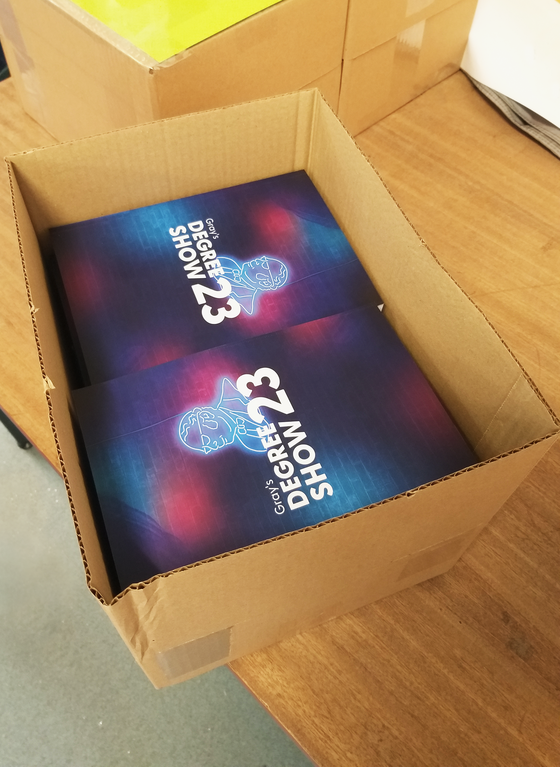
My biggest task was designing a 180-page catalogue that included the work of all graduating students across Design & Fine Art. More than 350 catalogues were produced and given to students, stakeholders & guests.
A full digital version of the catalogue is also available on Issuu.
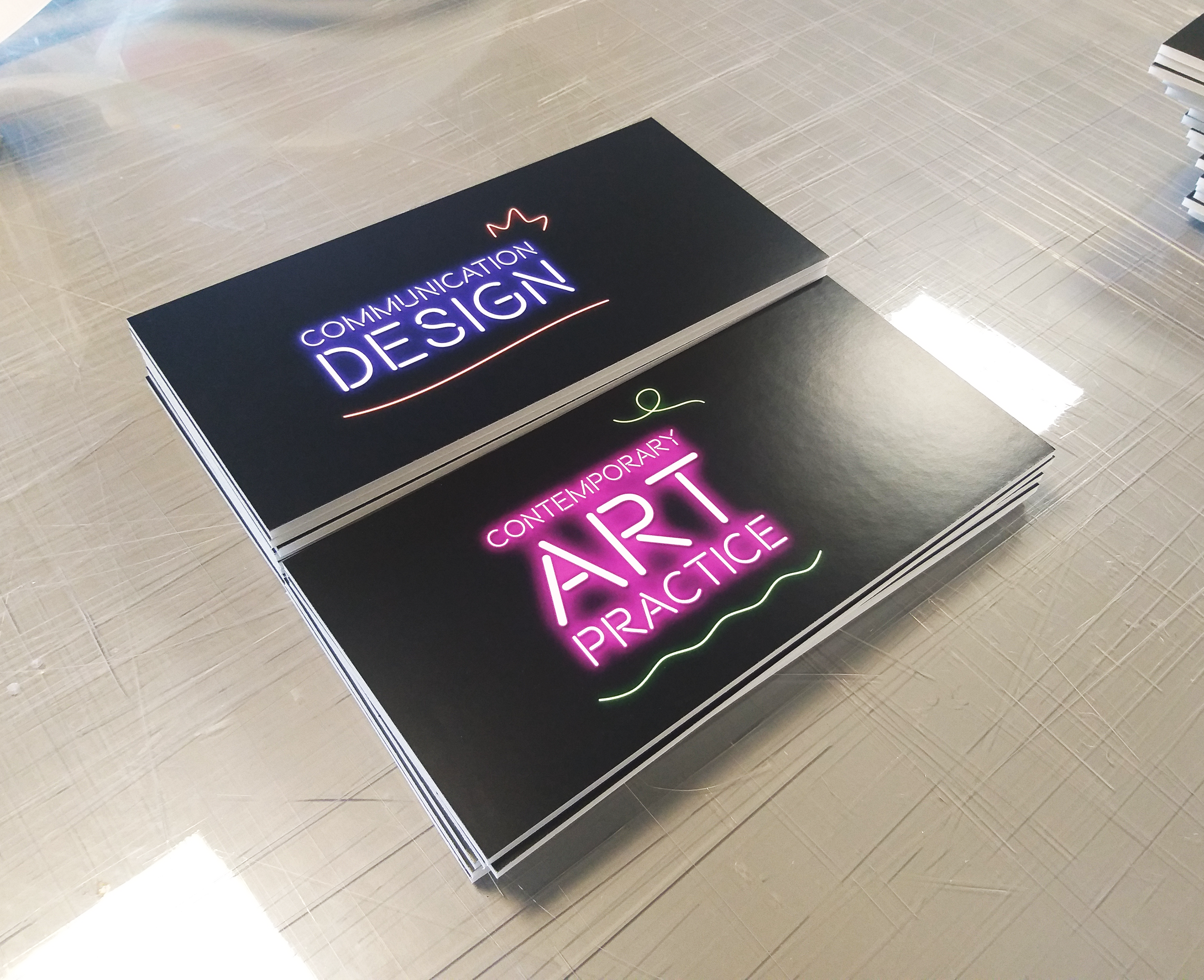
Another one of my tasks was creating the directional signage for the event - I had to design, mount and trim over 40 pop-out signs for the hallways in Gray's School of Art.
I also designed large-scale vinyl for the Communication Design exhibition space and screening room, as well as the Painting section.
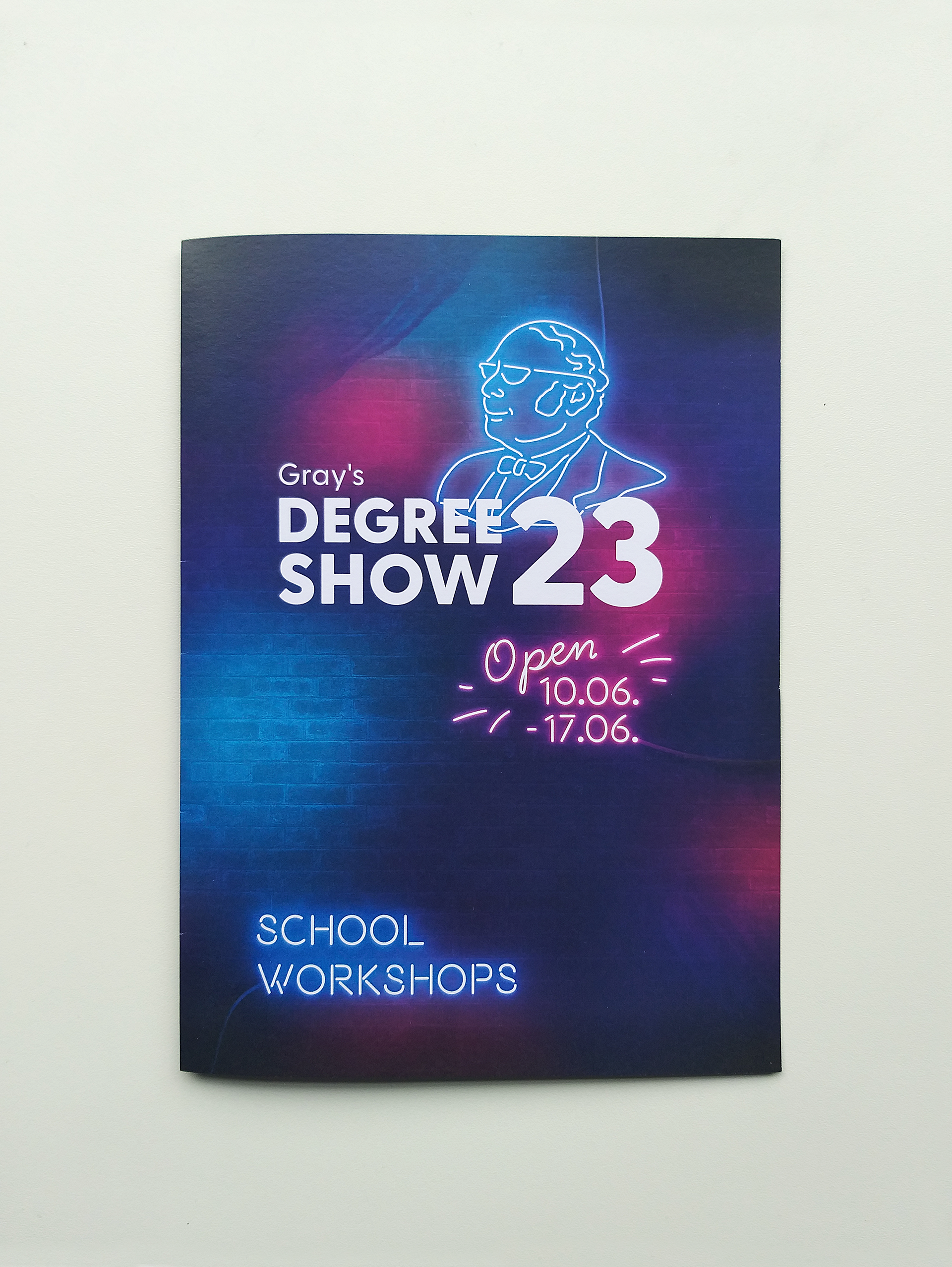
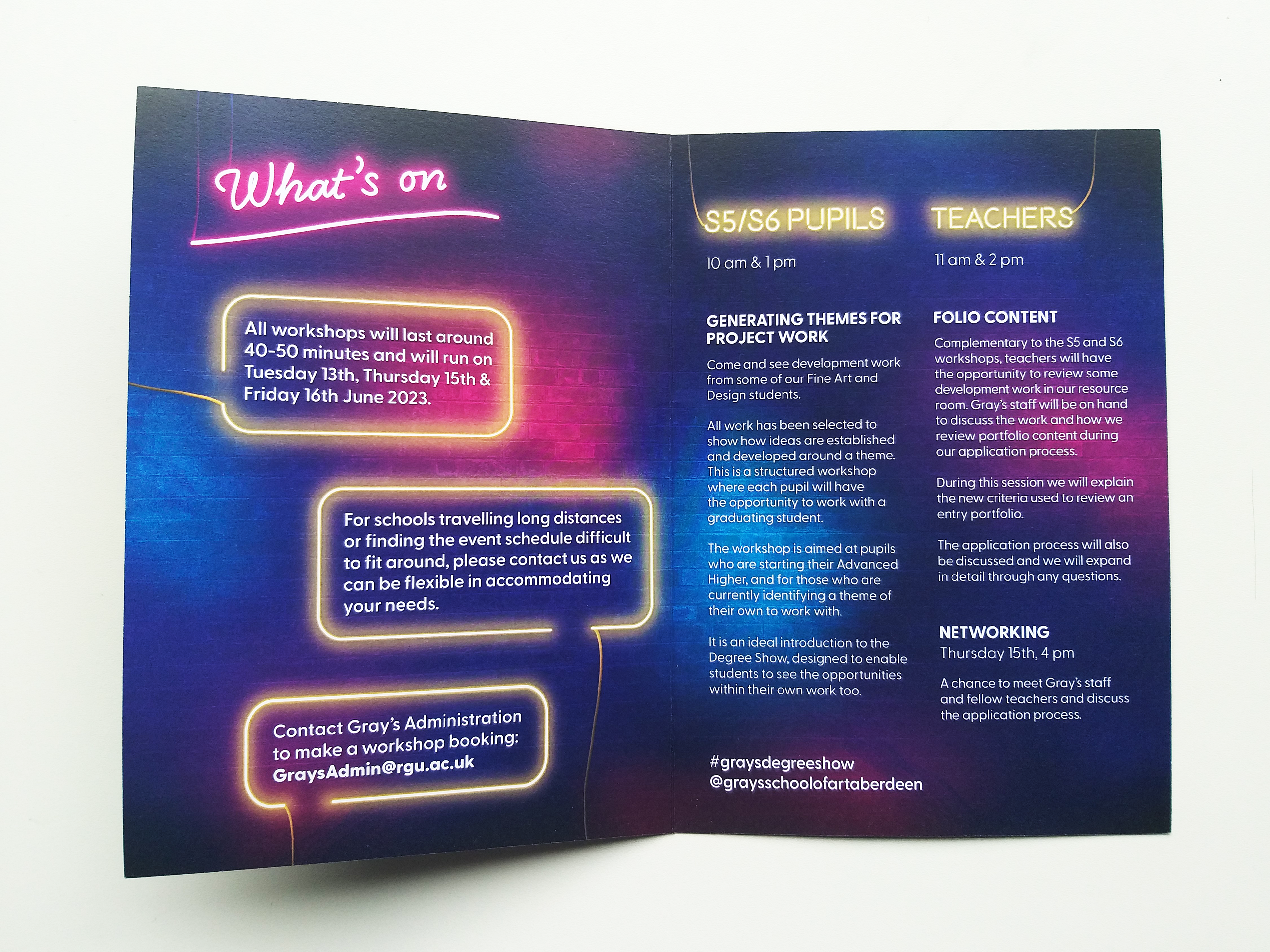
Another outcome - a leaflet with information about all the student workshops organised, which also had a digital version.
The initial visuals I had suggested were more heavily centered around energy, electricity, collaboration and interaction, and I had proposed a more stylized look with a distinctive tone of voice and engaging graphics and symbolism.
For the interior, I was also inspired by movies & contemporary neon signs and proposed creating an immersive experience that would activate all senses and transport visitors to a different world, while also taking into account the resources and time available.
*Might post my alternative vision soon 👀*